
NASA/JPL CellLines Visualization
Finding the unique cell in dozens of petri dishes
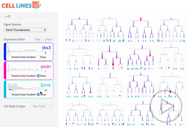
Cell biologists at Caltech biologist Michael Elowitz’s lab have developed complex systems to grow, record, and analyze families of cells. The problem is that their systems produce too much data making it difficult to visualize and understand. This project took the data the lab produces, data including videos, positions, lineages, and DNA information, and brought them together in a single interactive visualization, that we called CellLines.
In order to develop a visualization that would be helpful to biologists, we interviewed, observed, and tested prototypes on the scientists. In parallel we used rapid prototyping and data libraries like D3.js to develop visualizations. This all came together in an interactive website that the biologists could load their data into and then explore.
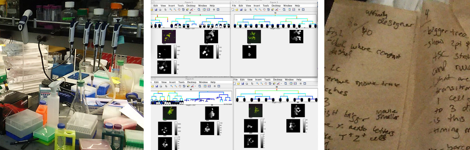
The result of this work took what was a tedious process of arranging MATLAB windows and squinting at two screens and transformed it into an intuitive system that shows only the information the biologist needs at any moment.
Preliminary Research
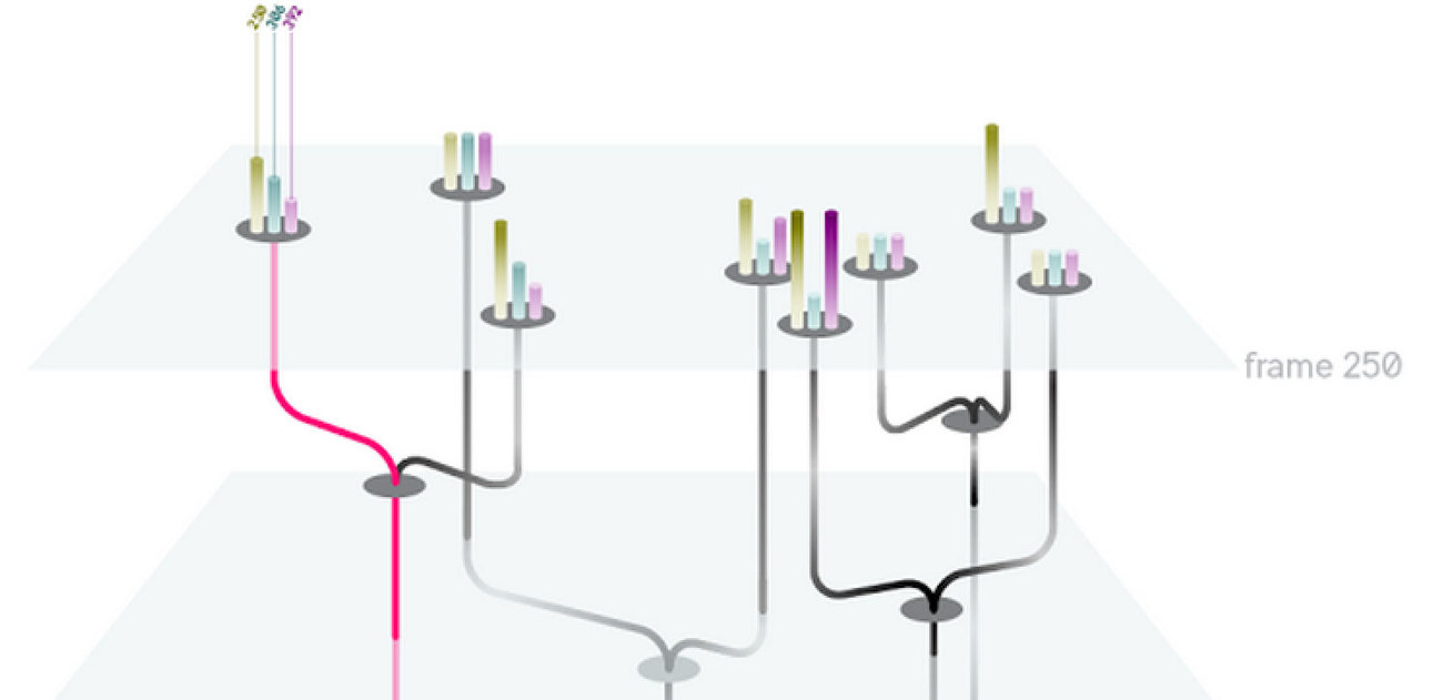
We began with preliminary research into what challenges biologists faces as well as looking at novel visualizations that may inform our work for visualizing trees of nodes with many pieces of attached metadata. We initially felt that a three-dimensional visualization of time + 2d space would make an informative core visualization for our system.
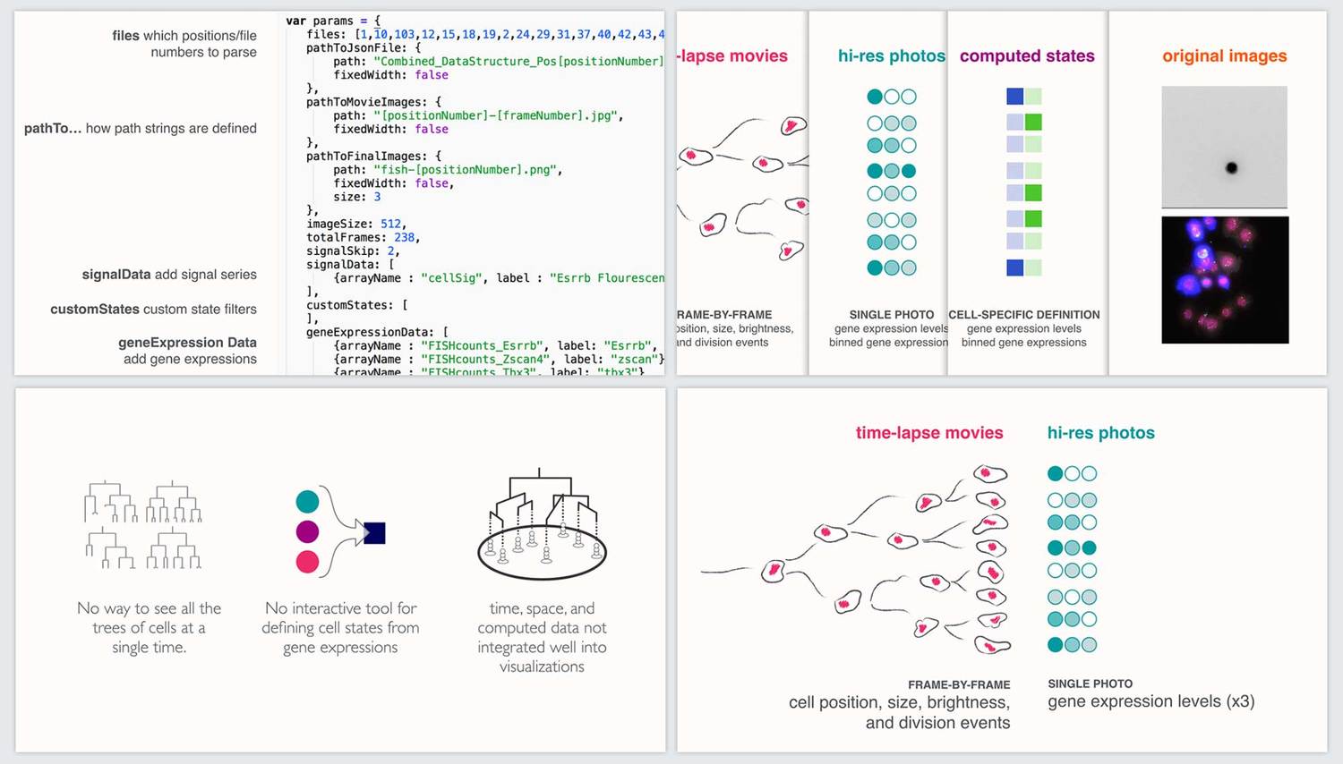
Contextual Inquiry
We engaged in a comprehensive contextual inquiry to understand how our visualization could address the pain points associated with the researchers’ daily data work. We made three main findings from this:
- Biology wet labs are often very disorganized and information-overloaded. Thus our solution should be visually minimal and clear.
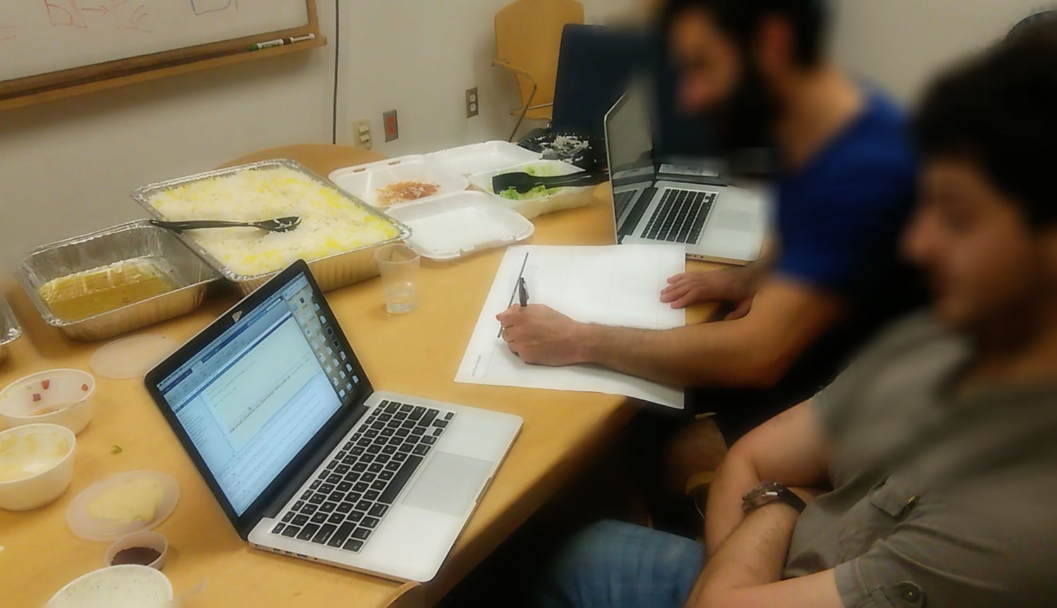
- Researchers manually tiled Matlab windows on the computers to compare sets of trees. This time-consuming arranging indicated the importance of comparing trees to better understand sets of cell data.
- Researchers took notes on just about any piece of paper. Our system would need to include some kind of annotation features to save interesting views of the data.
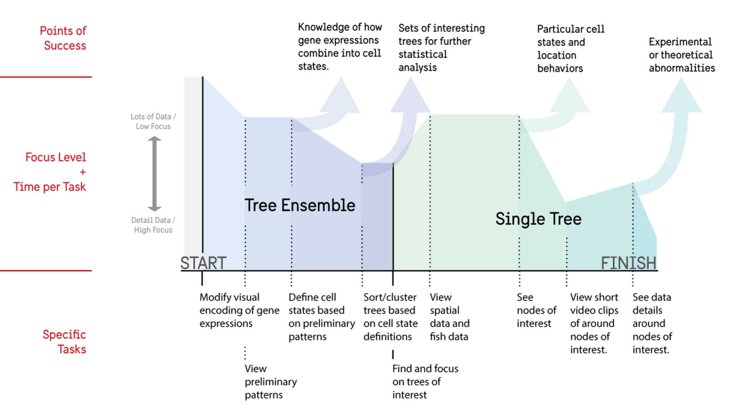
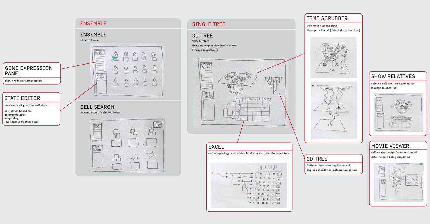
From the contextual inquiry we created an ideal user flow that researchers would engage in on a repeated basis. This included both an overview of all cell trees for analysis as well as a focus view for additional information.
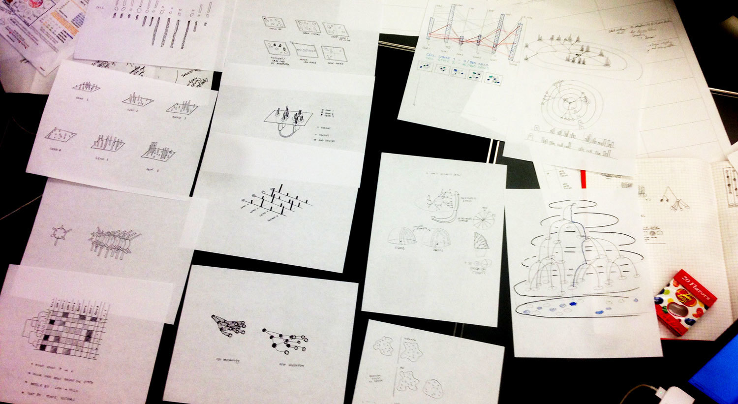
Ideation and UI Design
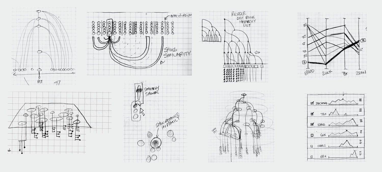
Based on our idealized user flow, the preliminary research, and conversations with a consulting developer, we developed a variety of visualizations that we as designers felt could meet the needs of the researchers. We engaged in a number of fast iterations where we sketched ideas, showed them to the researchers, and got their feedback on how our designs could be applied to their data.
We eventually ended up with a hybrid 2d small multiple overview of the data paired with a three-dimensional detail view.
Prototyping
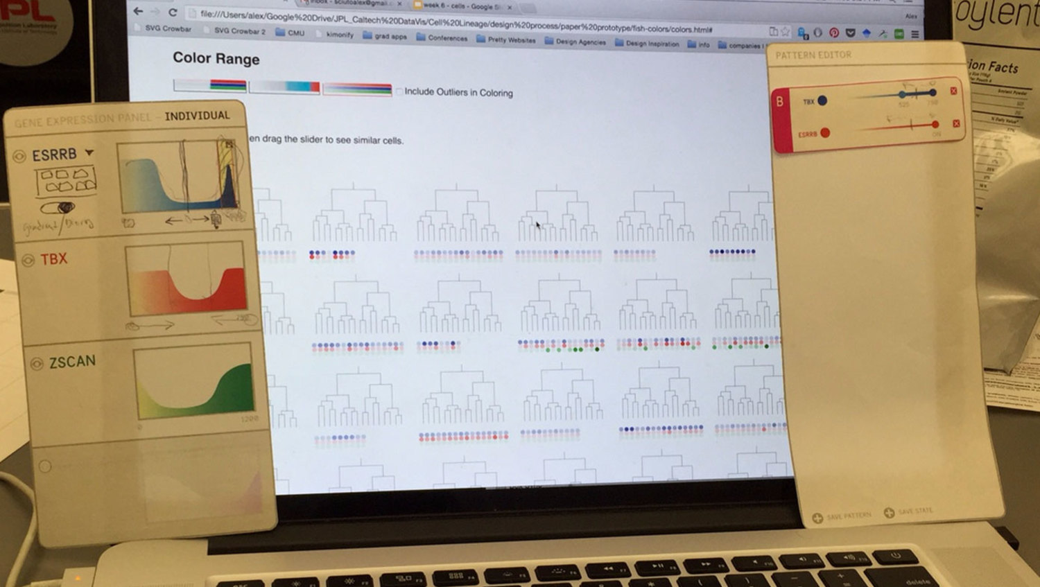
A challenge when designing and user-testing visualization systems is finding ways to incorporate representations of real data without the pain of developing a complete system. We chose to develop a semi-wizard-of-oz system where the researcher pointed at printed panels of what they desired to do with the data, and the designer executed it through the browser. In this way, we developed the core visualization without worrying about developing any additional user interface.
While we did uncover many small interface needs through the paper/digital prototype, the most important insight we had was that the actual petri-dish images were missing from the experience. The researchers had assumed just seeing representations would be enough. This was not enough.
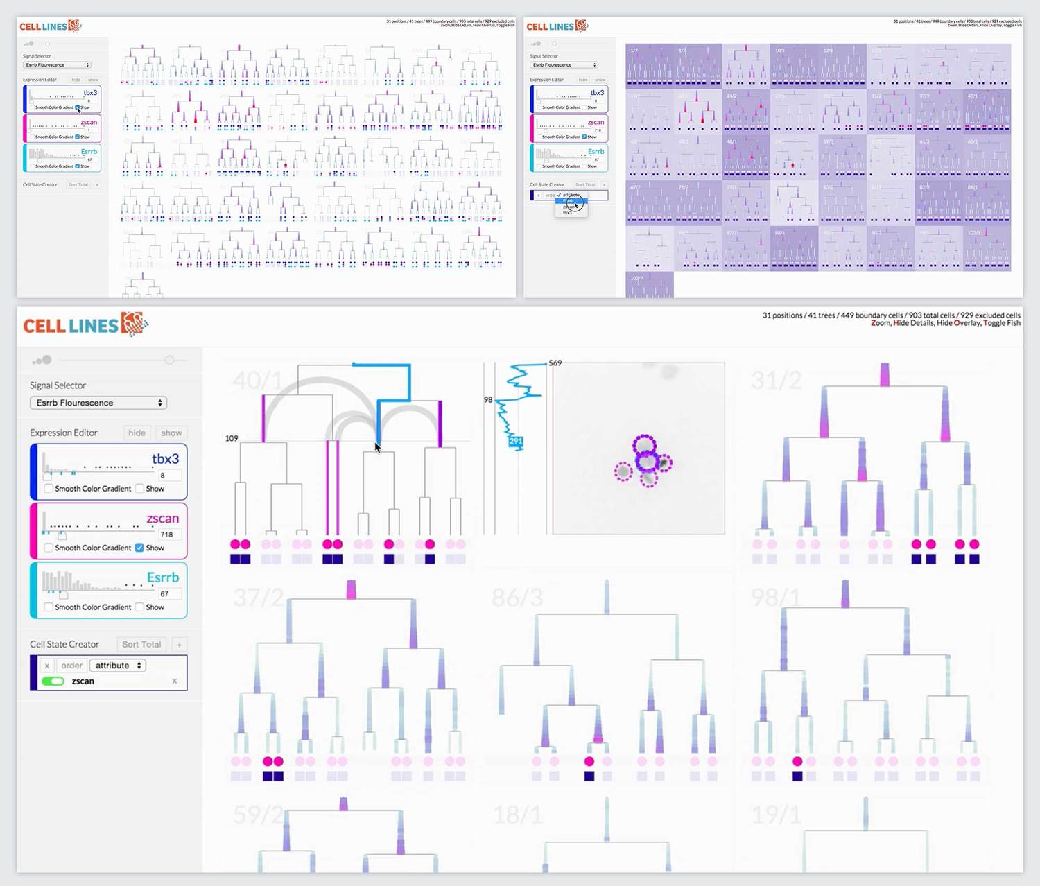
Final Prototype
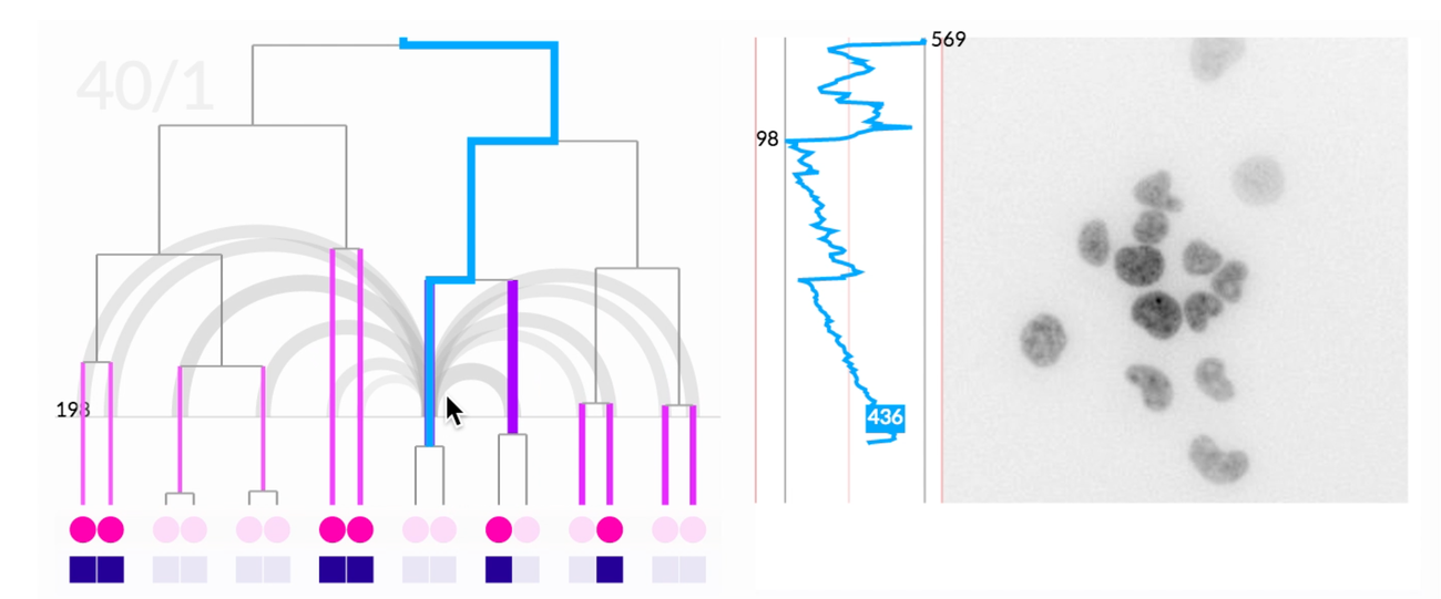
The most novel visualization aspect the system was the scrubbable petri image window. This window also overlaid pre-analyzed metadata like lineage information and relationship distance. When we offered the researchers the final prototype, this feature that brought together lineage information, spatial information, and images was the most compelling feature. It ignited their desire for tool adoption.
The research team adopted the tool and continued to develop it. They have shared it with other labs doing similar research. A very positive result!
Communication and documentation
In order to encourage adoption and additional development of our tool, we developed a timed twenty-minute presentation as well as documentation on how other researchers could use the tool through a customizable settings file. We presented the work to both the lab and the wider CalTech/JPL community.
