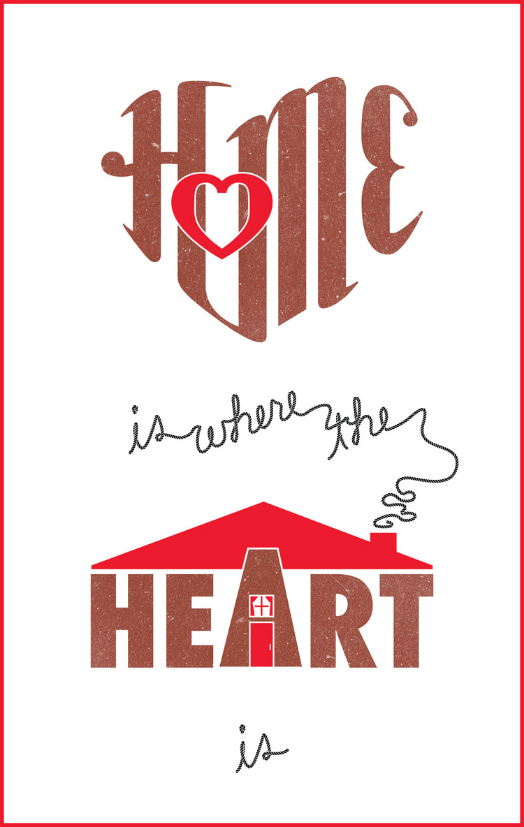
I have a lot free time in Madrid!
With that free time I’ve been looking at a lot of really cool lettering designers on the internet. Jessica Hische’s website and portfolio are really awesome, and her style is so fresh and enjoyable to look at. I really can’t get enough of her work, especially her images of artfully arranged words like the ones here. So with lettering on my mind, I thought I’d try my hand at creating some kind of poster composed entirely of words.
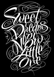
Obviously my Home is Where the Heart is poster looks nothing like Jessica’s work (good thing for her!), but it has some thematic resemblance to Alan Ariail’s calligraphic poster (on the right). Both are turning the words themselves into shapes that illustrate the written content. I really like how Alan includes stars, a moon, and a heart in his illustration of a quotation about dreams.
Feeling a little homesick for the US while in Madrid, the “home is where the heart is” saying was on my mind. Since the saying equates the two, I started playing with ways to form HOME into a heart shape. The H and the M were easy to conform to a heart-shaped outline because their long vertical strokes could be shortened or lengthened as needed. Making the O and E fit were more problematic. I took a mulligan with the O opting to just replace it with another heart, but that leaves an awkward, undefined space between the top of the H and top of the M. It’s an important part of the heart shaped outline.
Beyond the HOME, I didn’t really have any concrete ideas on how to finish the poster in Illustrator. Extending the A in HEART was pretty obvious with a few sketches, and I added the rope-font for “is where the” and “is” to contrast it with the thick solid letters of HEART and HOME.
Anyways, hope you enjoy looking at it. It was fun to make. You can see a few more detailed images here.