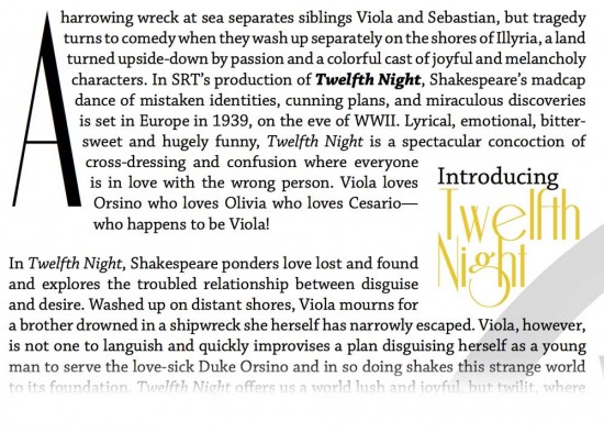
I’m not a fan of Riesling, a free font that is pretty popular because of its retro, art deco style. Its spacing and vowel-widths are very uneven that give it an unfinished look. BUT, you get what you pay for.
That said, I think it’s capital A is perfect for making into a dramatic drop-cap. Because it’s so thin and narrow, You can make it really tall without wasting that much page space. And it’s straight edge lets text nicely wrap around it.