During my two week break in St. Louis, one of my goals have been to get this website, alexsciuto.com, into manageable shape so I can actually show the stories, art, designs I’ve done in a way that looks good.
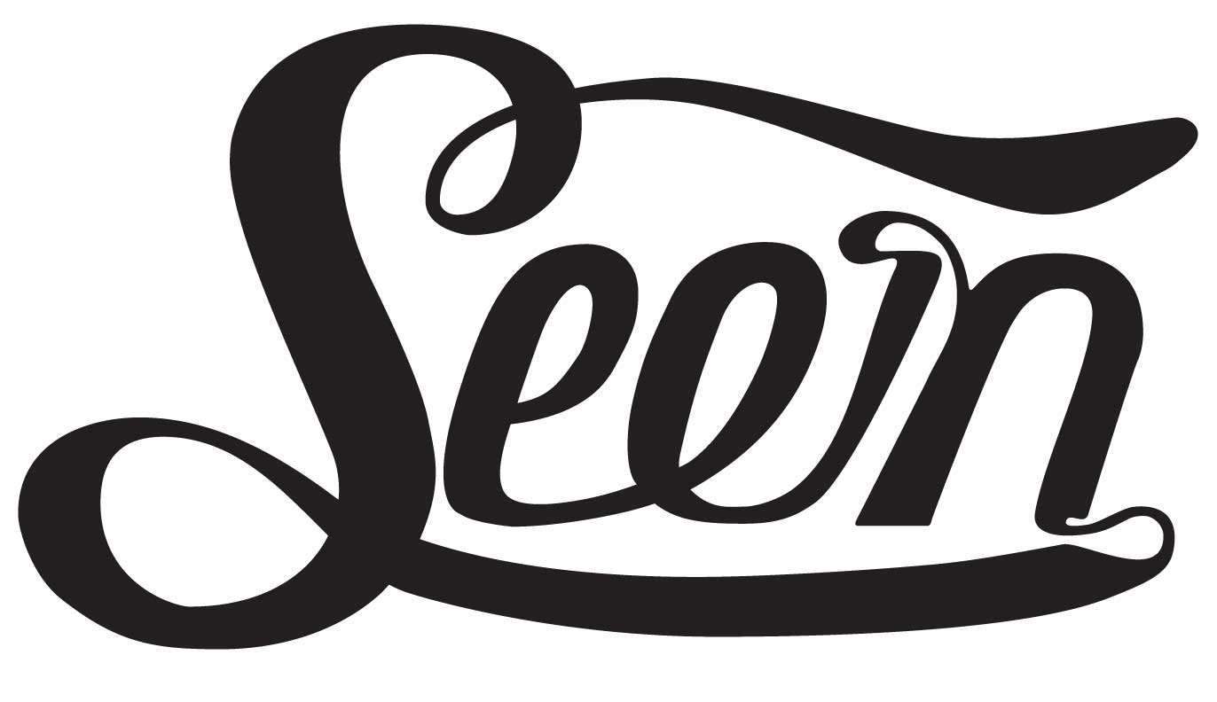
Of course, I haven’t gotten anywhere with the redesign yet, but I have been playing with ways to portray the word “Seen.” I’m not sure what inspired me to make my own custom font, but I know I’ve always been curious about calligraphy and using computers to design how a specific word looks.
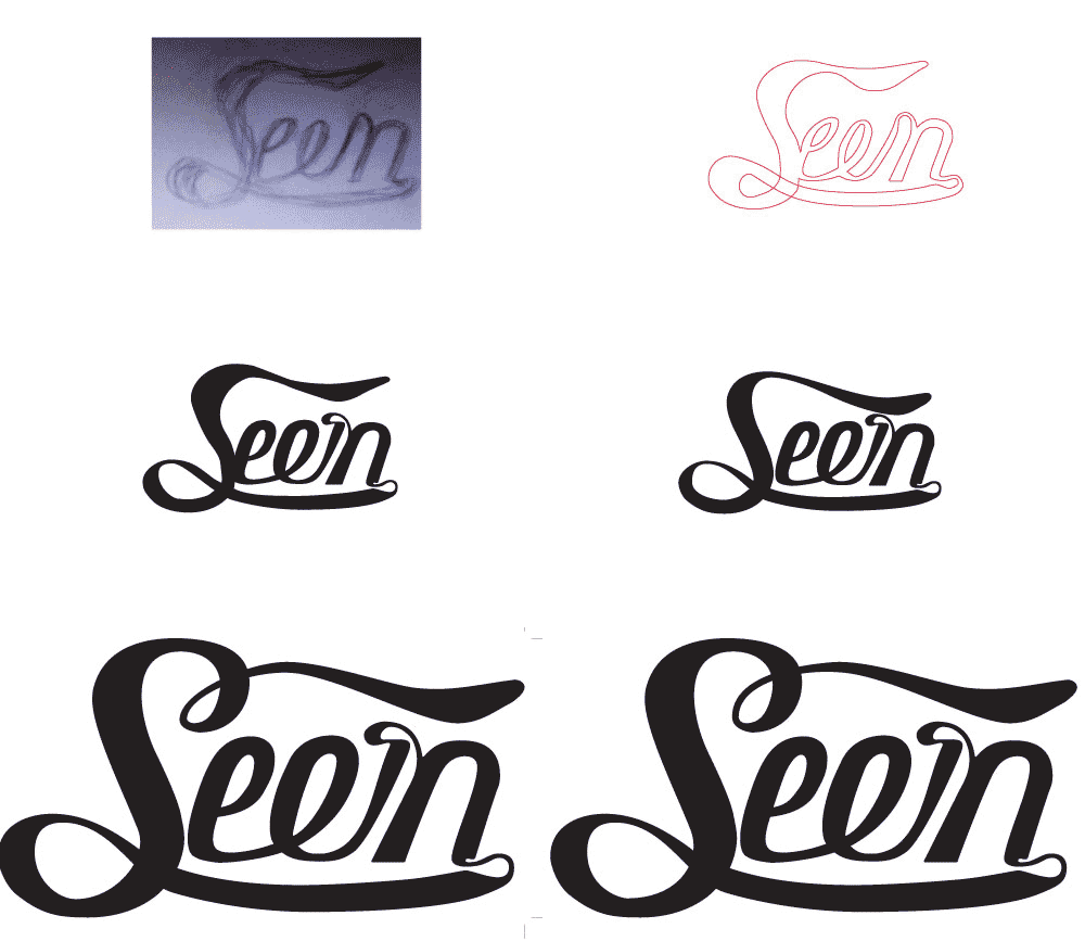
I’ve also been trying to do more creative work away from the computer, using pens and pencils and other non-digital tools. This design started out as a sketch on a notebook. IT actually started out as four or five sketches in a notebook. I used the built in camera on my laptop to capture the image I wanted. That was so much easier than finding and using a scanner! So for the lazy, if you need to get an image into your computer and don’t care that much about the actual quality of the capture, use the iSight camera as a primitive scanner.
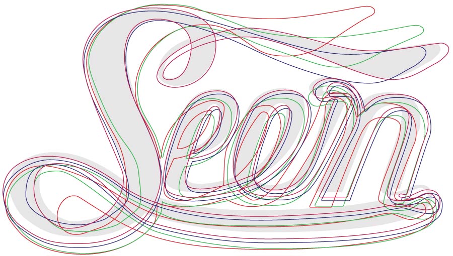
The actual designing of the image in Illustrator took a lot longer than I expected. It took five or six hours of digital tweaking and pinching to turn the rough outlines of my hand-sketch into an image that looked at least alright on the screen. Creating digital lines that look even and smooth is really hard to do, even when you’ve got a pattern to base your work on.
There were a couple of breakthroughs during the tweaking process that through random chance gave me insight into what the rest of the design would become. The first aha! moment came when I was creating the downstroke on the first e. The downstroke is thick, more straight than curvy, and ends with a Nike-esque swoosh that leads to a thinner-but-not-thin upstroke. The proportions and spacing of that stroke were created without any planning or foresight—they just came together. But with that stroke defined, it really defined the other characters very well. I kept coming back to that stroke to compare the other parts to make sure what I was working on had the same spirit.
Another aha! moment came when I was stylizing the flourish right before the n. Originally, the entire swirl was thinner and less solid. It just didn’t work with the other thick lettering. But by selecting the left half of the outline, I shifted it left, and ta-da it was nearly perfect. While I learned that so much of working with lettering is in the minutest details, sometimes a jarring shove leads to unexpected and pretty conclusions.
So I’m still not done with this design. The two loops on the S still don’t look very right to me, and the second e still feels unrefined, but I’m really happy with how things turned out.